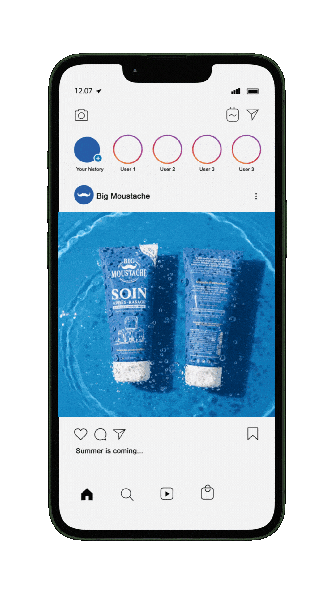
Big Moustache
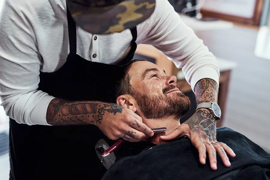
Client: French grooming brand offering shaving and skincare products for men, combining subscription services and retail distribution.
Context & objective
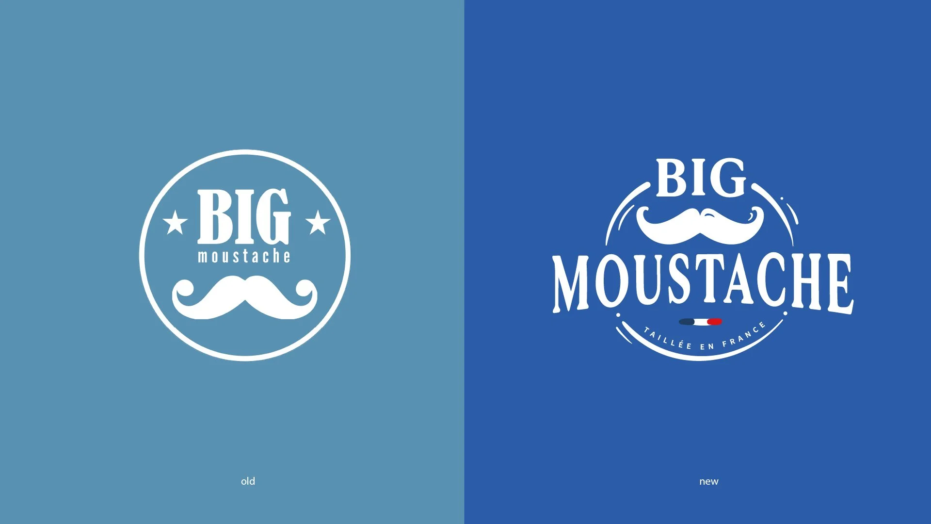
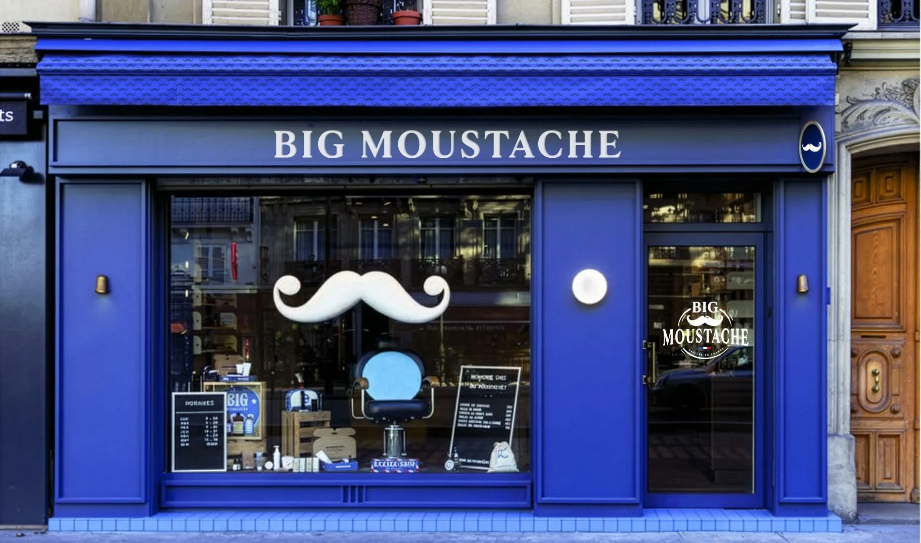
As the brand evolved beyond razors, it needed a stronger, more scalable identity for retail and product diversification.
Two key constraints guided the redesign:
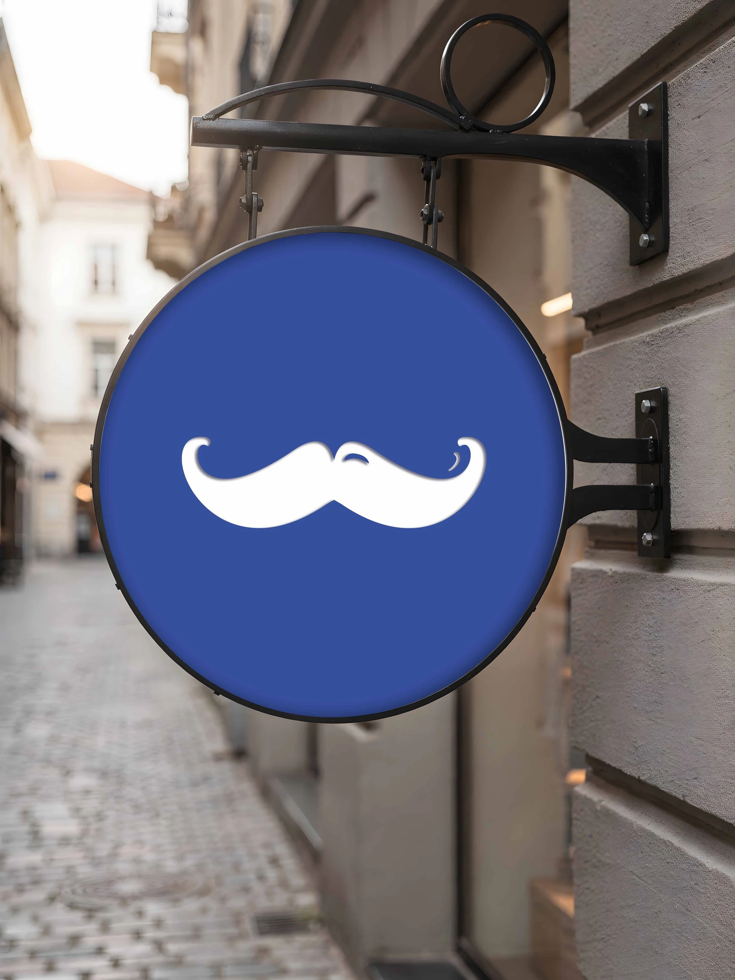
a mandatory moustache and a circular logo structure.
Creative direction
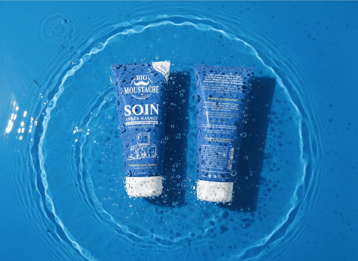
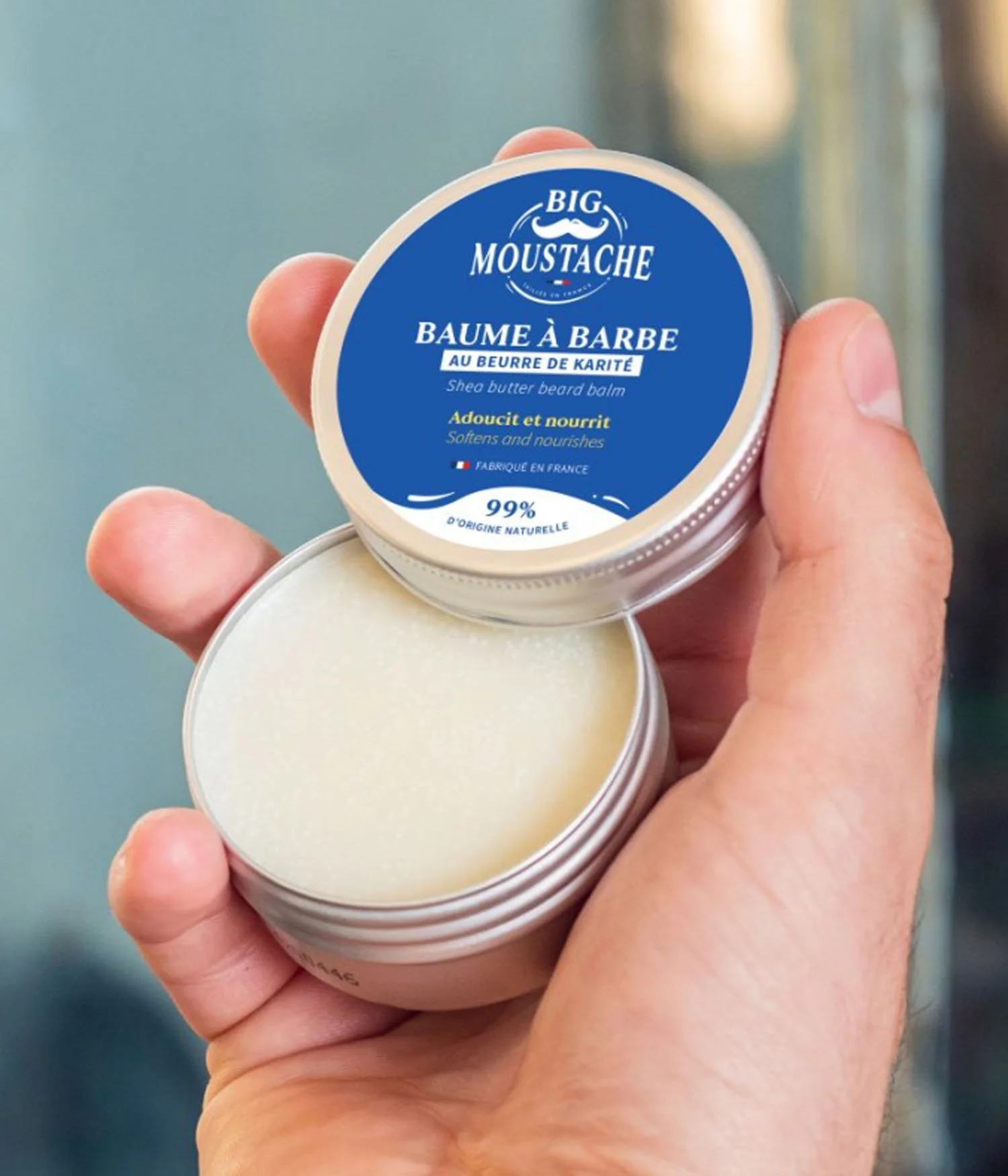
We developed a vintage inspired identity rooted in French barbershop culture.
The circular logo became a seal of quality, reinforcing recognition and shelf impact.
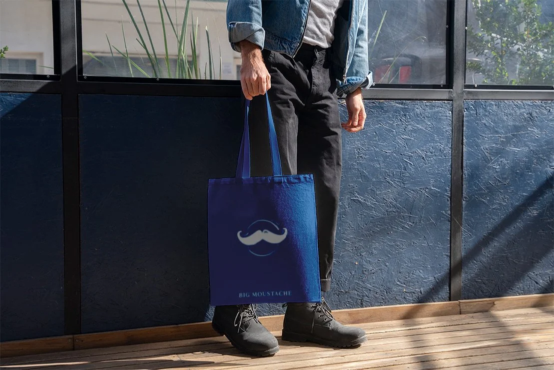
The moustache was refined into a bold, symmetrical emblem.
“Taillée en France” expresses both precise grooming and tailoring codes, evoking structure and savoir faire.
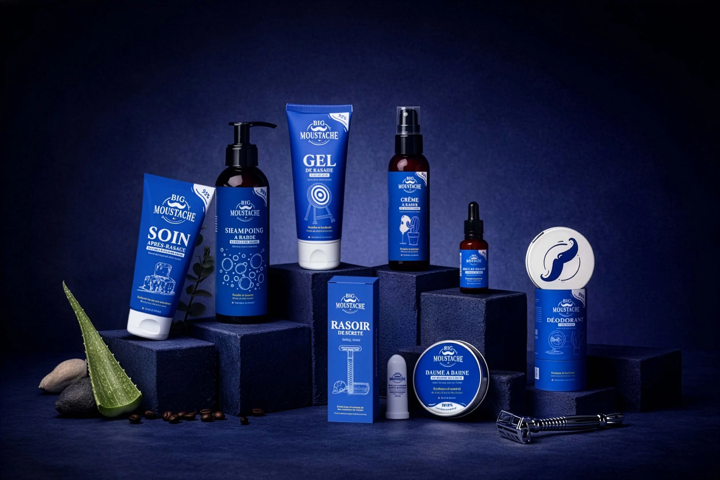
Scope
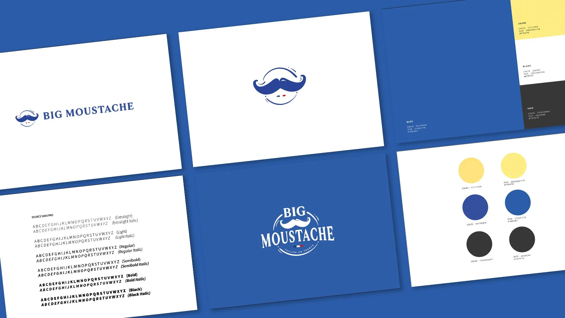
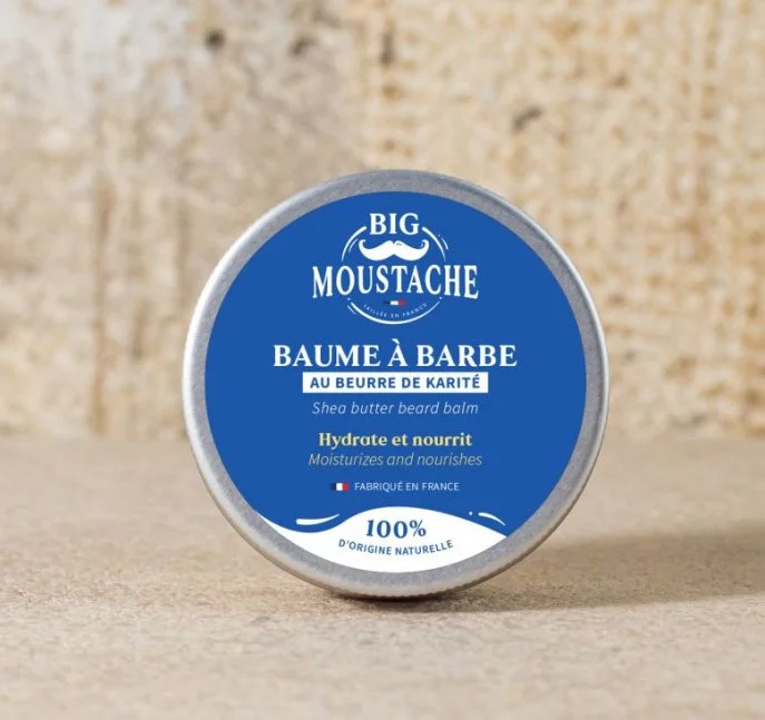
Logo, color palette and typography system
Brand guidelines
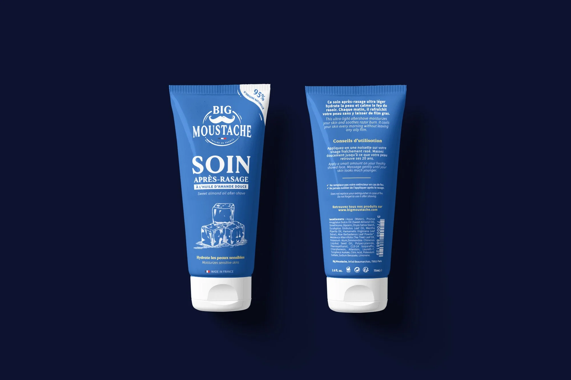
Master packaging architecture
Scalable templates for product extensions
Impact
Stronger brand recognition
Clearer range architecture
Cohesive and scalable design system