Client: The Royal Path — Therapy and life coaching center, Italy.
Context & objective
The brand needed a refined and coherent visual identity to reflect its positioning as an elegant and transformative life coaching practice.
The objective was to elevate the perception of the center while expressing depth, renewal and personal growth.
Creative direction
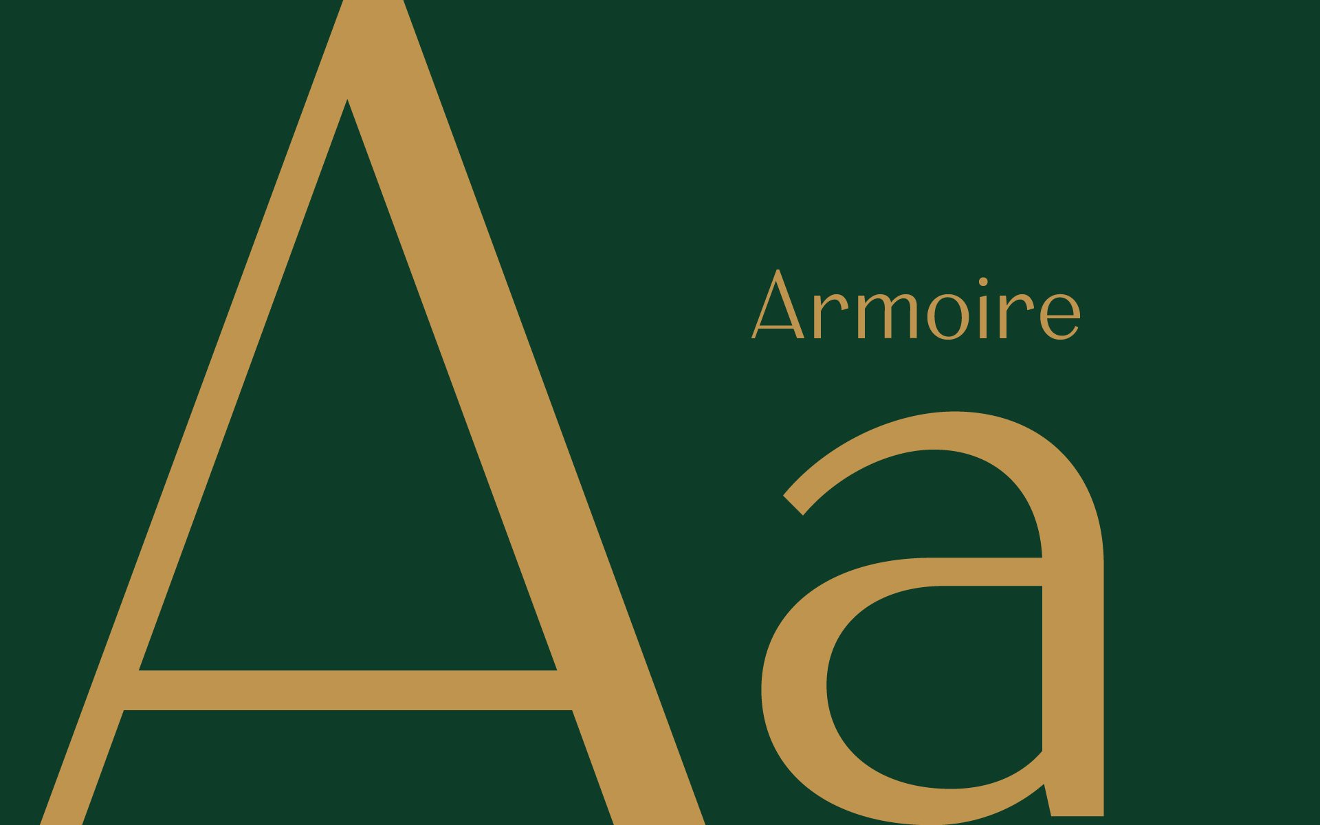
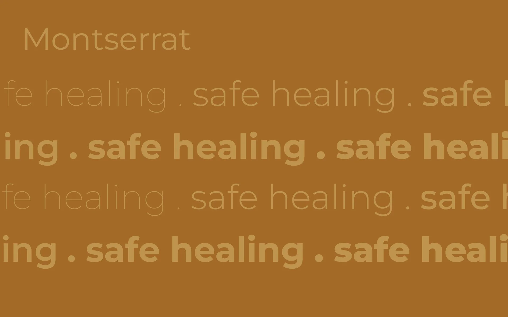
We developed an elegant and refined identity built around modern typography with character.
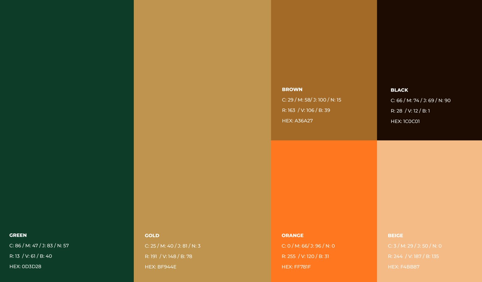
The visual language draws from earthy, natural tones to evoke grounding, substance and inner balance.
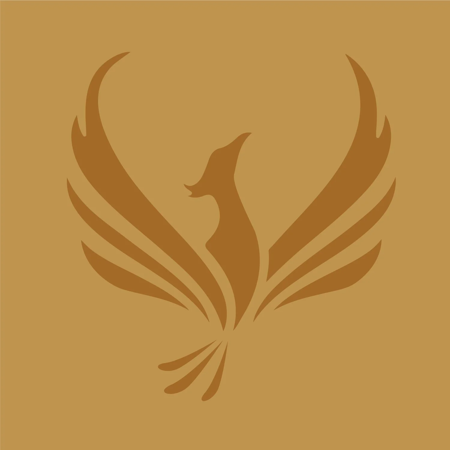
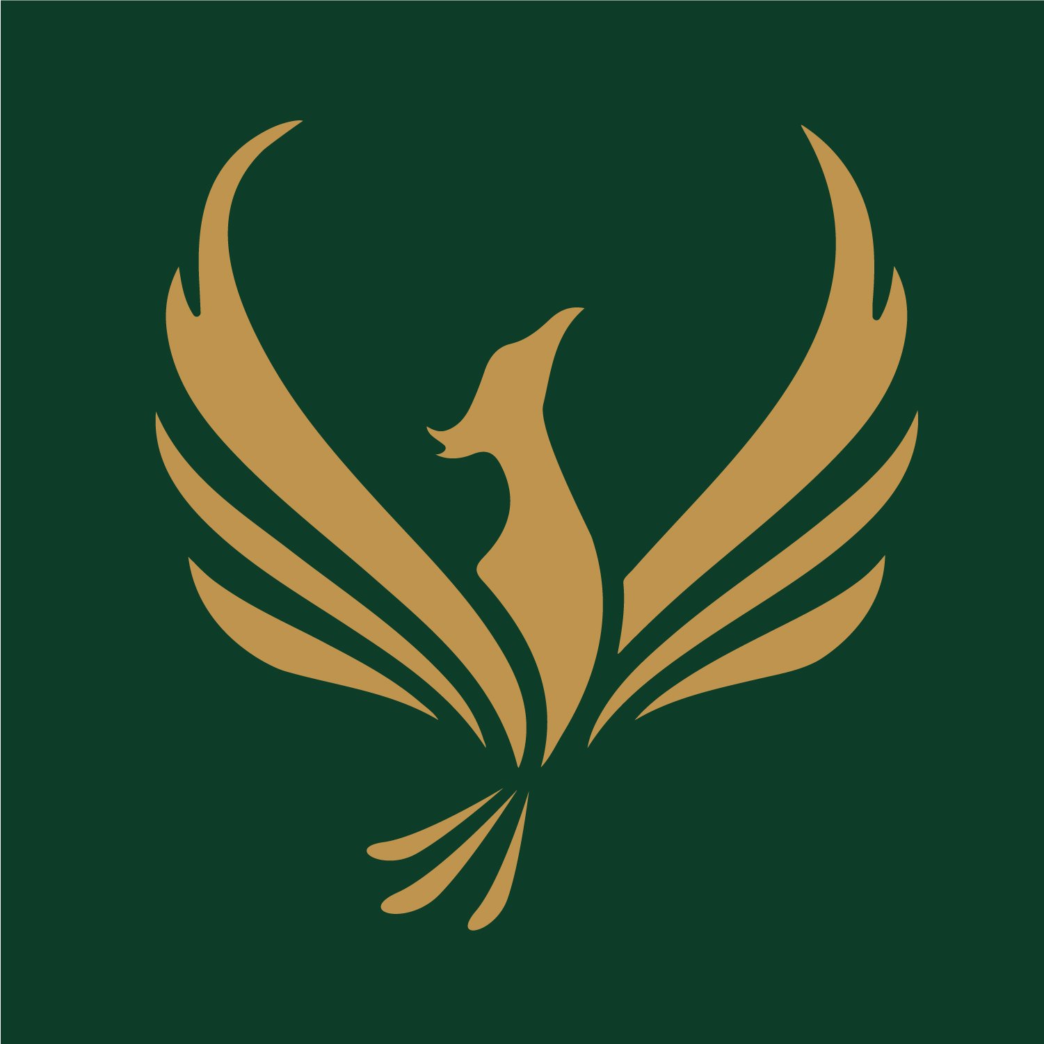
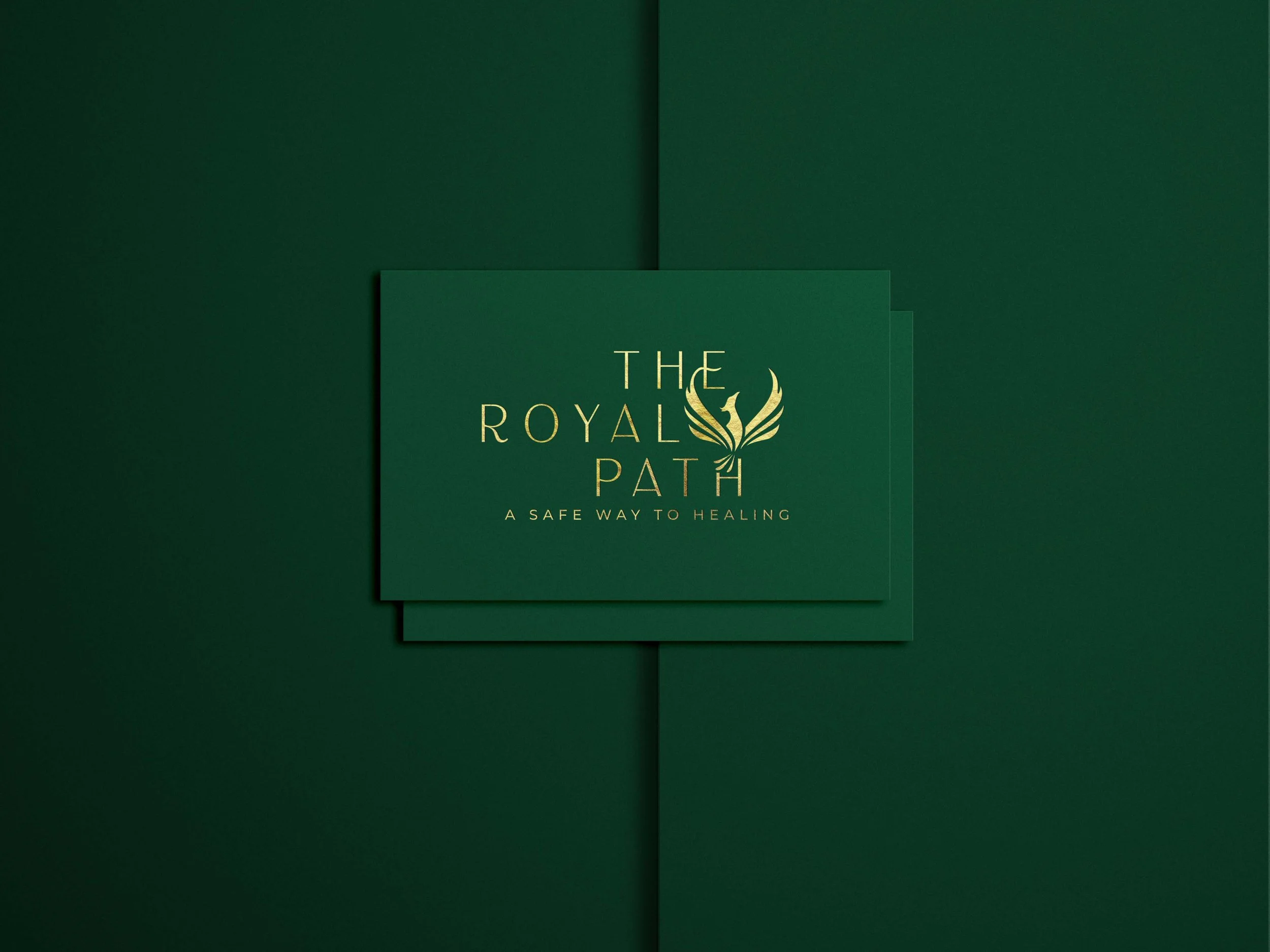
A majestic phoenix is integrated within the typographic system, symbolizing transformation and rebirth. Rising from its ashes, it becomes both a narrative element and a distinctive brand mark.
The result is a subtle yet powerful identity that conveys sophistication, resilience and personal elevation.
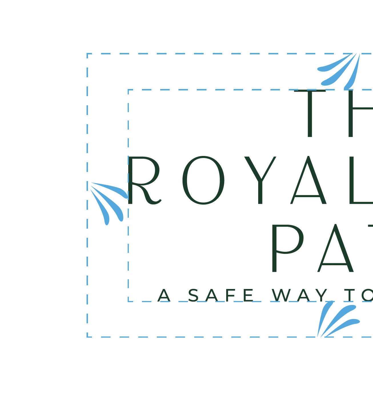
The Royal Path
Scope
Logo redesign
Color palette
Typography system
Business card design